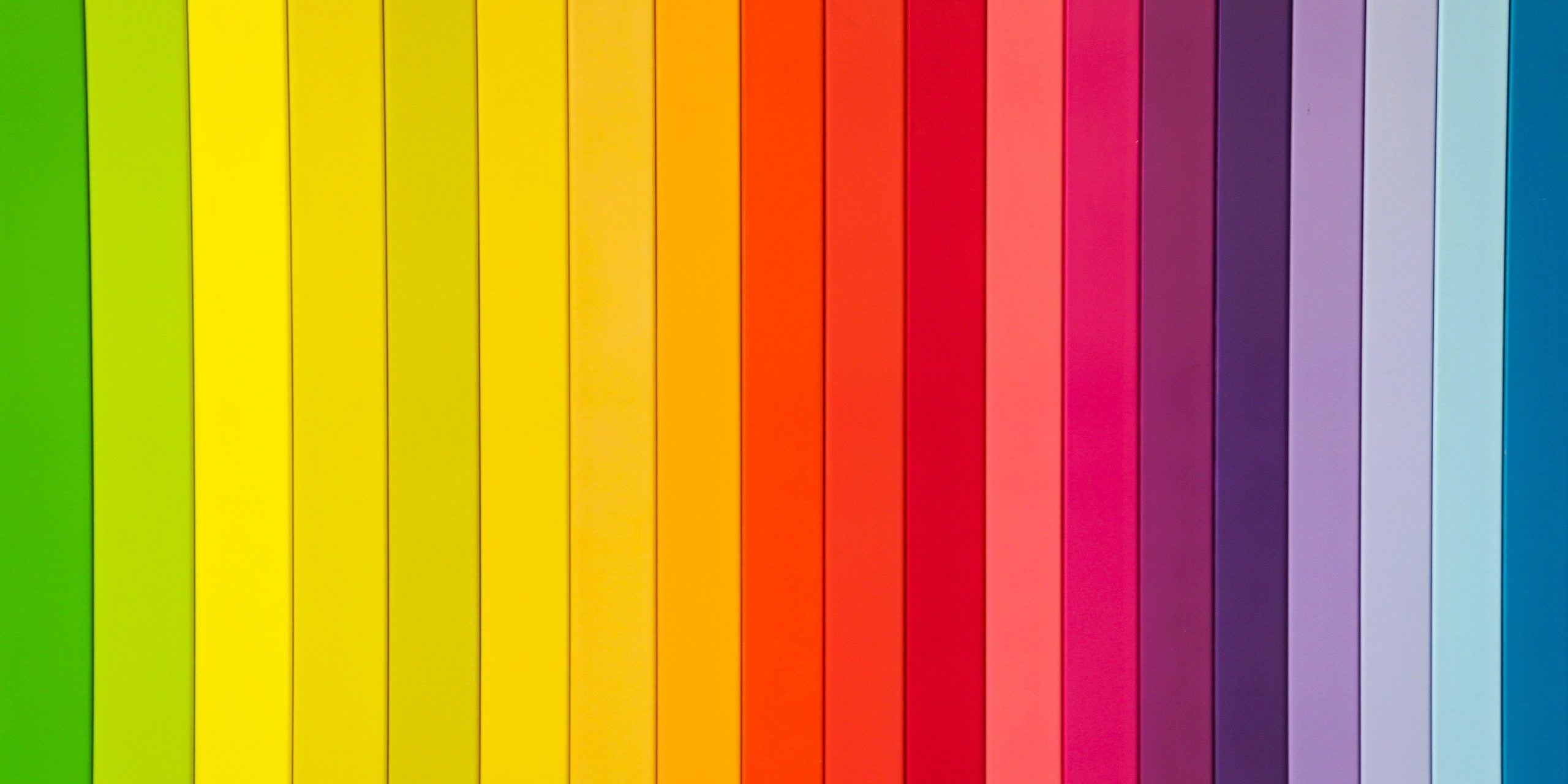
Color communicates. Brands are instantly recognized by specific color hues. For example, with the color green, we have 7-Eleven green and Starbucks green. Distinct shades are how a brand separates itself from others.
Selecting colors for a brand is not about picking a favorite color, it’s about what you intend to communicate without words. Colors are associated with feelings and themes. Branding color selection is nuanced and sets an intention of what mood or influence you want to associate with your brand.
But branding is just one aspect of advertising. Colors can be used for signs that don’t necessarily involve your brand identity (example: announcements). Strategic color choice enables a sign to draw attention to itself by use of what colors stand out the most.
So, what are the best colors for advertising signs? If you’ve ever wondered what was behind the color decisions of the most famous brands out there, then look to color strategy.
Color Psychology for Signs
Colors play a fundamental role in messaging for brands and advertisements. Red is common because it grabs attention with its boldness. Since it’s associated with aggression, it packs a punch.
Let’s explore the nuance of colors and think about where we’ve seen them before.
Red is the color of taking action
Light reds and pinks: love, passion or passive, sensitivity, friendship, and femininity.
Dark red: leadership, courage, rage, anger, wrath, vigor, willpower, excitement, energy, pulse, hunger, and physical movement.
Reddish-brown: stability, harvest, and nature.
Examples: Coca-Cola, Kellogs, Target, Wendy’s, Burger King
ESPN, and Netflix.
Blue is the color of authority, security, and trust
Dark blue: wisdom, reason, loyalty, expertise, and stability.
Light blue: peace, tranquility, disarming, and bodies of water.
Examples: Facebook, Ford, Volkswagen, American Express, PayPal, and Samsung.
Yellow is the color of optimism and fun
Bright yellow: caution, attention, happiness, energetic, spontaneity, and light.
Light yellow: sunshine, warmth, cheer, and positivity.
Examples: McDonald’s, Shell Oil, Best Buy, BIC, Hertz, and DHL.
Green is the color of nature and health
Dark green: money, jealousy, ambition, and greed.
Medium green: health, freshness, growth, and life.
Blue-green: protection, healing, and emotional well-being.
Olive green: peace.
Examples: Whole Foods, Starbucks, Perrier, Land Rover, and BP.
Orange is the color of encouragement and motivation
Medium orange: heat, success, creativity, youth, extroversion, and freedom.
Light orange: warmth, optimism, instinct, spontaneity, and socializing.
Red-orange: desire, pleasure, domination, aggression, and action.
Gold: wealth, money, and prestige.
Examples: Amazon, Harley-Davidson, Nickelodeon, Mozilla, Fanta, and MasterCard.
Purple is the color of royalty and richness
Dark purple: deep emotion, spirituality, psychic, and mystery.
Medium purple: wealth, wisdom, compassion, imagination, inspiration, and creativity.
Light purple: sensitivity, femininity, intuition, family, harmony, romance, and nostalgia.
Examples: Planet Fitness, Taco Bell, Yahoo!, and Hallmark
Black is the color of power and mystery
Elegance, death, evil, absolute, secrecy, sophistication, intrigue, and luxury.
Examples: Nike, Jack Daniels, Puma, Loreal, Chanel, and Calvin Klein.
White is the color of purity
Modern, cleanliness, simplicity, innocence, neutral, and understated.
Examples: Adidas, Burberry, Tesla, Sony, and Cartier.
Grey is the color of neutrality and practicality
Professional, efficient, formal, calm, balance, compromise, mature, unemotional, and conservative.
Examples: Mercedes Benz, Lexus, Apple, and Wikipedia.
When a business chooses its colors, it’s usually for a specific purpose. When selecting colors, be mindful of what the colors represent and express.
Most Visible Color Combinations for Signs
The best colors for advertising signs are the colors that pop. However combining certain bold colors can make a sign unattractive or worse, hard to read. We want to use colors together without having them clash.
The color wheel is made up of primary, secondary, tertiary colors plus all the shades of an infinite spectrum. How well the colors work together creates complementary color groups.
Contrast can change the appearance of color by overlay and pairing. On a blue background, red tones cast a different hue than how they appear separately and vice versa. Red inside of black makes the red pop while red on a white background shrinks the red.
The best colors for outdoor signs are the bright and bold colors that shout. For example, the best colors for real estate signs come from a primary color palette of mostly reds, blues, and whites. Think RE/Max.
So when planning out the colors for attention-grabbing outdoor signs, you want to pick just a few colors that look right together, but also have optimal contrast. It needs to be attractive but also legible from a distance. Between the colors, a brightness difference of at least 70 has the best yield for reading.
Here are some examples of color combinations that are effective for easily read outdoor business signs.
- Black, dark blue, gray, or red lettering on a white background.
- White or yellow lettering on a black background.
- White or yellow lettering on a dark blue background.
- Black or red lettering on a light blue background.
- Black, dark blue, or red lettering on a yellow background.
- Yellow or white lettering on a red background.
Once you have a sign designed, print out a prototype and test it out. Ask others what they think about its appearance and view it from various angles/distances.
Communicate Using Color Strategy
Knowing what colors will stand out the most and what they indicate is key in color selection for both peripheral signs and branding (example: labeling a building with brand lettering.)
When planning a sign’s design for branding or otherwise there are two fundamental factors: attraction and clear communication. We use colors that draw attention to themselves and have an implicit meaning to express our brand and/or send a clear message.
At Accurate Signs, our goal is to provide businesses in the Mesquite, Tx and Dallas, TX areas with signage that gets the message across and makes a great impression. We’re here to help you plan out the right colors to meet your business goals. Contact us anytime!

