An eye-catching sign can help draw customers into your business. But what exactly goes into creating a sign that grabs the attention of passersby? One of the most important factors, along with font and color, is the size of your signage letters. When the text on your sign is big and bold, not only does it stand out more, it’s also easier for people to read.
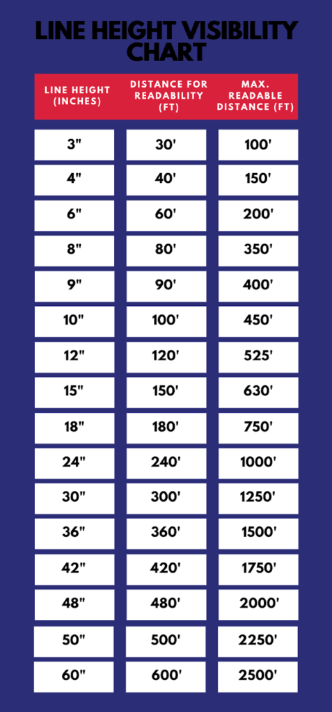
Whenever you are planning out your sign, it’s important to consider the maximum visibility distance of the text size you’ve chosen. The maximum visibility distance indicates how far away a person can be from your sign while still being able to read it clearly. One helpful tool you can use to determine what size lettering is best for your sign is something called a letter height visibility chart. We’ll walk you through how to use this chart below as well as provide some tips for font and color choice.
How To Use A Sign Letter Height Visibility Chart

For example, if you have a typical pedestrian walkway and parking spaces in front of your business, then people driving through the parking lot will be about 50 feet from your front door. For a typical grocery store lot, it’s about 200 feet from the main road to the front of the building. A large retail location like a mall or Walmart might have about 300 feet of parking spaces between the front of the store and the main road.
Once you’ve got the distance nailed down, check to see where it falls on the letter height visibility chart. This will give you an idea of what size signage letters you need for either the ideal readable distance or the maximum readable distance.
For the ideal sign readability, find the distance measurement in the middle column of the chart and see what the corresponding line height is in the far left column. To figure out what the maximum readable distance is, follow the same procedure, except this time find your distance measurement in the far right column.
For example, If your sign is going to be about 100 feet from where the viewer is, your signage letters should be 10 inches tall to be most easily read. However, according to the letter height visibility chart, you can also have 3 inch tall lettering and your sign will still be readable from a distance of 100 feet.
Now that you’ve determined what size lettering your sign needs, let’s move on to font and color.
Font Type for Signage Letters
The font you choose can have a huge effect on the readability of your sign. Certain types of fonts are clear and easy-to-read from a distance, while others are difficult to read no matter how much the viewer squints at your sign. But which fonts are a bad choice and which can help you send a clear message to your customers?
We all have our favorite fonts for documents, but that doesn’t necessarily translate to sign visibility. Elegant script fonts are lovely, but not optimal for distance. These types of scrolling fonts can be difficult for potential customers to make out, which means they are not reading your intended message.
Fonts that are highly legible with a good weight (thicker typeface) are ideal for visibility. Here are some others that come highly recommended.
- Arial
- Helvetica
- Gil Sans
- Times New Roman
- Cooper Black
Once you’ve chosen the perfect font for your sign, it’s time to choose colors that will help your sign stand out.
Best Color Schemes for Signage Letters
Color is also a key factor in sign visibility. It’s important to pick a contrasting color scheme to make sure the letters on your sign really stand out.
One popular high-contrast scheme for business signs is white lettering against a dark, colored background. This is a great choice because it’s highly visible from afar and easy-to-read.
Here are some other color combinations to consider.
- White or yellow lettering on a black background.
- White or yellow lettering on a dark blue background.
- Black lettering on a light blue background.
- Black, dark blue, or red lettering on a yellow background.
- Yellow or white lettering on a red background.
As important as sizing is with the letter height visibility chart, the letters won’t show at all if the colors are wrong. Keep this in mind when designing your signs.
Once you’ve designed the perfect sign for your business, you want to make sure you put it in just the right place for maximum visibility.
For Optimum Visibility
If signs are made to be seen, then how do you maximize visibility? So far we’ve established that letter size, font, and color are the most important elements to consider, but how else can you make sure that you’re getting the most benefit from your sign? Spend some time finding the right spot to place your sign where it can get enough light to be seen.
Accurate Signs will provide a mockup of your sign so you can determine if it will fit your needs before the sign is made.
Sign Placement
Yes, letter size matters. But perhaps what matters more is where you put the sign. Signs should be close to the traffic and angled to where they can best meet the eyes of the public.
You also want to make sure it’s in a spot where the most people possible can see it. Traffic patterns may change, so adjust accordingly. However, before you make any plans on where to position your sign, you need to talk to your city or a knowledgeable sign company to determine what is allowed in your city.
Lighting Conditions
In much the same way that you can’t read a book in the dark, your customers can’t read a sign in the dark. Signs should be placed in areas with plenty of light or with lighting added (especially for night time).
In most cases, light makes signs easier to see, but sometimes it can actually make it more difficult to make them out. For example, pastel-colored signs (especially with light-colored lettering) may have reduced visibility when light hits the graphic. Signs with darker colors and contrast fare better in areas with lots of lighting.
Cons of Not Using a Sign Visibility Chart
So what if someone planning a sign design were to just wing it and not use a letter height visibility chart? Here are some things to consider if you plan to create your signage without letter height visibility guidance:
- Reduced usability: What if you have to move your signs? What if traffic patterns change? What if you want to use your signs for something else? Optimizing visibility helps your signs be seen no matter where they get placed.
- Wasted funds: If your signage turns out to be a flop, it’s a wasted investment. As they say in carpentry, “measure twice, cut once.” Careful planning pays off.
- Loss of competition opportunity: Signs help businesses stand out from the competition. Optimizing visibility ensures that your signs are just as effective (but hopefully more so) than your competitor’s next store or down the street.
At Accurate Signs, our goal is to provide Dallas businesses with signage that gets the message across through optimal visibility. We offer store signs, promotional signs, lighted signs, and high-impact plastic letters for businesses in cities like Mesquite, Garland, and other cities in the Dallas area!
We have the experience to help you perfect your signage strategy with a winning design. Contact us anytime!

